
Maximum Score 15/100
See current scoring methodology HERE
.gif)

White-balance
We have just come through a stormy winter here in Ireland. I spent much of my winter morning commutes to work over the winter thinking about how I would approach this project and one of the highlights of that time was renewing my appreciation for lighting in all its complexity. Winter light in Ireland is ever-changing. The morning commute has been all about "the blue hour" before sunrise, when the first rays of sunlight passing through the upper atmosphere are scattered by the gas molecules in the air and some of the the lower wavelength, blue portion of the light spectrum rays get directed down towards the ground. The world is bathed in blue. Then, at sunrise there is an instantaneous shift from blue to yellow as direct sunlight pushes its way through the thick atmosphere and predominantly the red and yellow longer wavelengths of the spectrum dominate the lighting conditions. This is the "golden hour".
The phenomenon is RAYLEIGH SCATTERING.
For the remainder of a mid-winters day here in Ireland the sun barely creeps above the horizon.
The golden hour light is replaced by a dull yellowish light which never reaches the crispness and brightness even of an early morning in mid-summer.
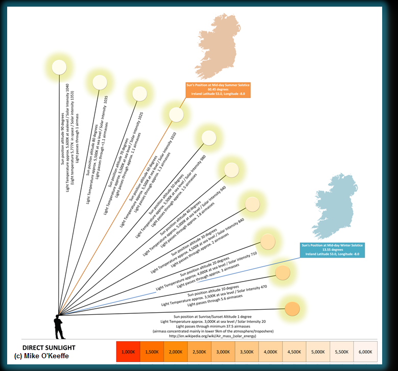
The image below depicts the sun's position in the sky in Ireland at mid-day on both the shortest and the longest days of the year. Light must pass through 3 to 4 times more air (termed air masses) at mid-day in mid-winter in Ireland than it does at mid-day in mid-summer and the affect is to make the light, and the sun itself look more reddish-yellow in winter. Come early morning in mid-summer in Ireland the sun is already much higher above the horizon, high enough in fact that sunlight is white-looking to our eyes at that point.
A blue sky is a product of the same phenomenon. This scattered blue light from the sky is itself in effect a second light source which illuminates everything from every angle. If you have ever looked at images taken on the Moon or in space you will have noticed everything looks contrasty and the shadows are deep and black. No details can be resolved within these deep shadows.
Here on Earth we can readily pick out objects that are in total shade. Even in the shade they are being illuminated by light coming from the sky and in some cases perhaps reflected light from other surfaces nearby. This blue sky light should always be borne in mind when looking at birds photographed under shade - they are in effect being illuminated by a blue-filtered light. This blue cast will affect their apparent colouration of everything it touches.
In the animation below I have depicted a map of the sky as it appears in mid-summer versus mid-winter. Some of the notable points to look out for are as follows.
In mid-summer here in Ireland true nighttime is not really achieved. We have a protracted dusk which leads directly into dawn.
In summer the sun quickly reaches a point high enough above the horizon that light colour temperature stabilizes and remains thus for a long period of the day. In contrast mid-winter lighting is in a constant state of change from dawn till dusk as the sun never really gets high enough in the sky to clear the dense atmosphere. Nights are long.
You will notice I have added a splash of pink (or more accurately magenta) after dusk. We dont see this every evening but its not uncommon. Where it occurs in the west around sun set it is related to atmospheric conditions. However it also occurs in the east soon after sunset. In that case the phenomenon is called ALPENGLOW and is easiest observed in areas with high mountain backdrops to the east.
For a more complete and detailed look at lighting in all its various hues I strongly encourage you to visit this LINK.
And that is just the start of it...
Below I have depicted an array of lighting conditions frequently encountered while observing and photographing birds. Note how colour, light intensity and shadows vary under different lighting conditions. The ideal conditions for viewing and photographing birds are a bright, overcast day when the sun is high in the sky and therefore the light at its purest. At all other times we must assume that the ambient light is unpredictable and ever-changing.
Just how important is colour anyway?
There is now a field guide for western palearctic birders which has no colour plates and merely uses text to convey critical identification features including colours. It covers 1,350 species occurring in the region, or over 10% of all bird species. The Advanced Bird ID Handbook by Nils Van Duivendijk has broken the mold and has been a great success among experienced birders. What strikes me most about this approach is that if we can do without plates, including their accurate depiction of colour in birds, is colour assessment really all that necessary for identification at all?
So far much of the focus in our Birding Image Quality Tool has been on the capture of detail.
75% of the total score as accounted for so far has been weighted on RESOLUTION, FOCUS and EXPOSURE. Good exposure is key to the capturing of rich, saturated colours. Under-exposed images are under-saturated and can suffer from digital artefacts such as noise. Over-exposed images tend to be over-saturated and bleached looking. Colours appear washed out.
As indicated above, another principal factor affecting accurate colour rendition in images is white balance. Again if you are not already well versed on all of this please visit the excellent CAMBRIDGEINCOLOUR.COM website for some useful tutorials.
When I started working on this project it dawned on me that I would need to try and weigh up each of the image quality parameters in some logical way and try and establish if some parameters were more important than others. I opened up my 2nd Edition Collins Bird Guide (Svensson et al) and started working my way through the book, noting down the top three identification criteria for each species and for males, females and immature plumages. I could have completed the same exercise using Duivendijk.
It quickly became obvious that colour is not a priority in the identification of most birds so it became clear why Duivendijk was able to do without plates.
Leaving aside bird sounds and jizz, neither of which are relevant to this discussion, I quickly discovered that the following tends to be the order of priority for bird identification (at least in this part of the world).
(1) FINE DETAIL (eg. fine feather detail, subtle structural or size relationships)
(2) COARSE DETAIL (eg, obvious plumage details, large or obvious structural or size differences)
(3) BOLD COLOURS (eg. rich breeding plumage, mainly confined to the males of the species)
(4) SUBTLE COLOURS (ie. subtle hues and tones which, as highlighted above may be hard to judge in the field and even harder to capture accurately in digital images)
(5) BOLD COLOURS (richly coloured field marks on female & immature birds tend to be among the rarest of critical ID features)
WARNING! This work is not complete. I havn't completed this exercise for all species. I stopped checking once a pattern had clearly emerged. I am merely using this as a rough guideline to weight the relative scoring of individual quality parameters. It is an interesting exercise all the same and I would be interesting to see what others find if they carry out this kind of exercise using the field guides from their own regions. Will the variety of colourful birds in the tropics bring the overall average up for colour versus detail?
To conclude, it is extremely difficult to capture colour accurately using a digital camera. This is obviously a major complication if an identification is partly dependent upon it. We also know of course that plumage and bare parts colouration in birds is highly variable. Lastly colours are very hard to describe or remember with accuracy. So we really have to be careful not to get too drawn in to arguments about subtle colouration in birds. That is not to say that colour doesn't have a role to play in ID. Before we can even begin to use colour in photographs as part of an ID discussion we must understand the complexity of light and how it interacts with everything in our environment. And, even then we must proceed with total caution.
No comments:
Post a Comment